

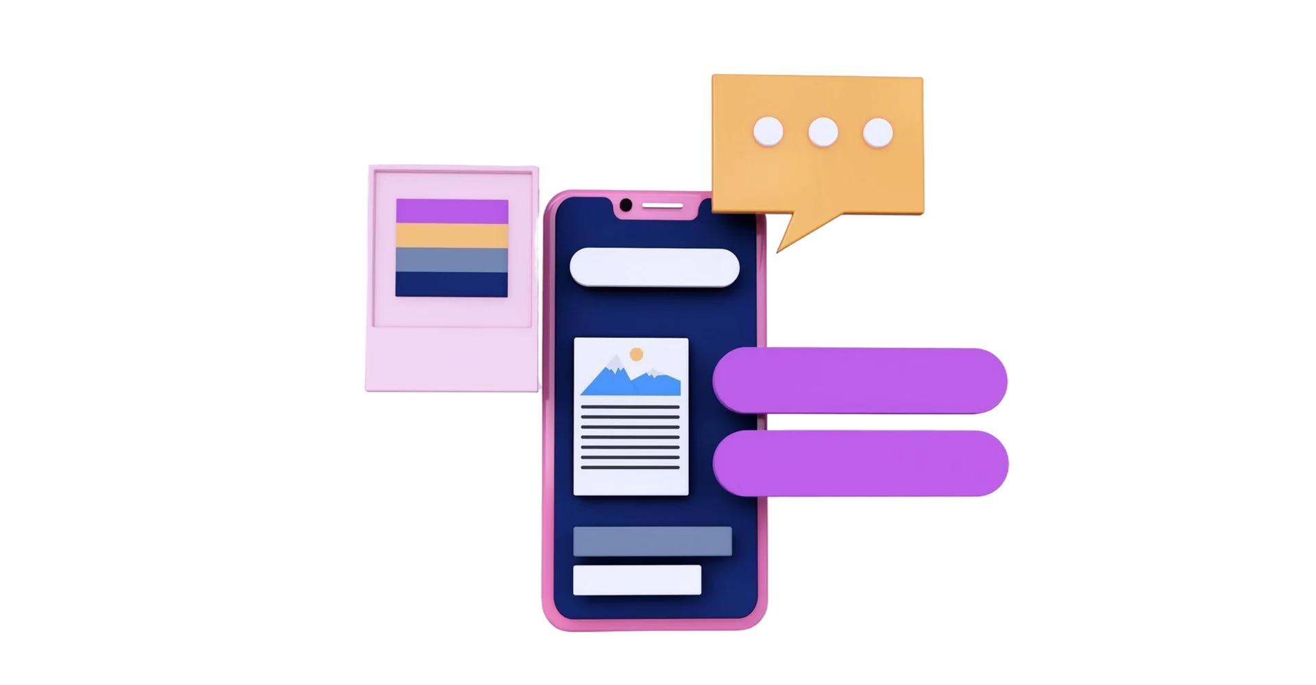
Mobile First Websites
Let’s talk
In today’s fast-paced world, over 60% of web traffic comes from mobile devices, and that number is only climbing. If your website isn’t optimized for mobile users, you’re likely missing out on a huge chunk of your audience. That’s where mobile first websites come in—designed specifically to deliver seamless, engaging experiences for users on the go.
What makes a mobile first website special, its benefits, and how CompuBrain can help your brand thrive in the mobile-first era??
What is a Mobile First Website?
A mobile first website is built from the ground up to cater to smartphone and tablet users. Unlike a desktop site that’s simply scaled down, a mobile website has a distinct design tailored for smaller screens. Its user interface (UI) and user experience (UX) prioritize touch navigation, fast load times, and intuitive layouts.
What sets these websites apart is its focus on mobile-only functionality. Think instant call-to-action (CTA) buttons like “Call Now,”, “Emergency Call”, “Get a Quote,” or “Shop Now” that make it easy for users to take action right away.
These features ensure your audience can connect with your services or products in just a tap, making interactions smooth and effective.
Benefits of a Mobile First Website
A well-crafted mobile first website does more than just look good—it delivers measurable advantages:
Improved User Experience:
Mobile first websites are designed for touch, with larger buttons, simplified menus, and easy-to-read text, ensuring users stay engaged.
Faster Load Times:
Optimized for mobile networks, these sites load quickly, reducing bounce rates and keeping users on your page.
Higher Engagement:
Instant CTAs and mobile-friendly features encourage users to interact, from filling out a form to making a purchase.
Better SEO Performance:
Search engines like Google prioritize mobile-friendly sites, boosting your visibility in search results.
Increased Conversions:
A seamless mobile experience means users are more likely to take action, driving inquiries and sales.
How Does a Mobile First Website Impact Your Brand?
Your mobile first website is often the first interaction a customer has with your brand. A clunky, slow, or hard-to-navigate site can frustrate users and damage your reputation.
On the flip side, a mobile website that’s sleek, responsive, and user-friendly builds trust and credibility. It signals that your brand values convenience and understands modern consumer needs.
By prioritizing mobile, you’re meeting your audience where they are—on their phones, browsing during a commute or waiting in line. This accessibility strengthens your brand’s presence and fosters loyalty among users who appreciate a hassle-free experience.
Mobile-First Website vs. Mobile Website
While the terms sound similar, there’s a key distinction between a mobile-first website and a mobile website:
Aspect |
Mobile Websites |
Mobile-First Website |
|---|---|---|
Design Approach |
Designed with mobile users as the priority, then adapted for desktop. |
Built exclusively for mobile devices, not necessarily scalable to desktop. |
Purpose |
Ensures a great experience across all devices, starting with mobile. |
Focuses solely on delivering the best mobile experience. |
UI/UX Focus |
Balances mobile and desktop needs with responsive design. |
Tailored for touch navigation and mobile-specific features. |
Development Scope |
Broader scope to accommodate multiple devices. |
Narrower scope, optimized for mobile-only use. |
Examples |
E-commerce sites that work on phones, tablets, and desktops. |
Apps or sites like mobile banking with mobile-only interfaces. |
Both approaches have their place, but a mobile first website is ideal when your audience primarily interacts with your brand through mobile devices.
FAQs
1. Why do I need a separate mobile first website instead of a responsive one?
While responsive websites adapt to different screen sizes, a mobile first website is purpose-built for mobile users. It prioritizes speed, touch-friendly navigation, and features like instant CTAs that cater specifically to mobile behavior, offering a more tailored experience.
2. How long does it take to develop a mobile first website?
The timeline depends on the complexity of your site, but a basic mobile first website can take 4-8 weeks to design, develop, and test. CompuBrain works closely with clients to ensure a smooth process and timely delivery.
3. Will a mobile website improve my search engine rankings?
Yes! Search engines like Google use mobile-friendliness as a ranking factor. A well-optimized mobile website can improve your visibility and attract more organic traffic.
4. Can a mobile first website handle e-commerce or complex features?
Absolutely. Mobile first websites can support e-commerce, forms, live chats, and more, all tailored for mobile users. Features like one-tap checkout or instant contact buttons make them highly effective for business.
5. How do I know if my current website is mobile-friendly?
You can test your site using tools like Google’s Mobile-Friendly Test. If it’s slow, hard to navigate, or lacks mobile-specific features, it’s time to consider a dedicated mobile website.
6. Are mobile first websites expensive to build?
Costs vary based on features and complexity, but a mobile first website is often more affordable than a full responsive redesign. It’s an investment that pays off through better user engagement and conversions.
7. Can a mobile website integrate with my existing systems?
Yes, mobile websites can connect with your existing CRM, payment gateways, or other tools, ensuring a seamless experience for both you and your users.
In a world where mobile devices dominate, having a mobile website isn’t just a nice-to-have—it’s a must.
By offering a fast, user-friendly, and action-oriented experience, a mobile website can transform how your audience interacts with your brand and increase the traffic and engagement rate.
Let CompuBrain craft a mobile website that connects with your users and drives effective results.